Introduction

Choosing a color scheme for your next creative project can be a daunting task. There are so many colors to choose from! Additionally, you want to make sure that your colors work well together, convey the right mood and message, and showcase your artistic style. Check out my blog post on color psychology: The Psychology of Color: A Comprehensive Guide.
But don’t worry, you don’t have to rely on guesswork or trial and error, *phew*! There are some proven methods and tools that can help you find the perfect color combination for your project. In this post, I will share with you some tips and tricks on how to use color theory, the color wheel, and color palette generators to create stunning color schemes for your next creative project. You can use color theory for art (this is my expertise, specifically acrylic paintings), fashion, web design, and so much more!
Color Theory + the Color Wheel

Color theory is a practical combination of art and science that explains how colors interact with each other and how they affect human perception and emotion. Color theory is based on the color wheel, which is a circular illustration of the colors of the visible spectrum, arranged according to their relationships. The color wheel can help you understand the basic types of color schemes.
Basic Color Schemes
1. Complementary Colors

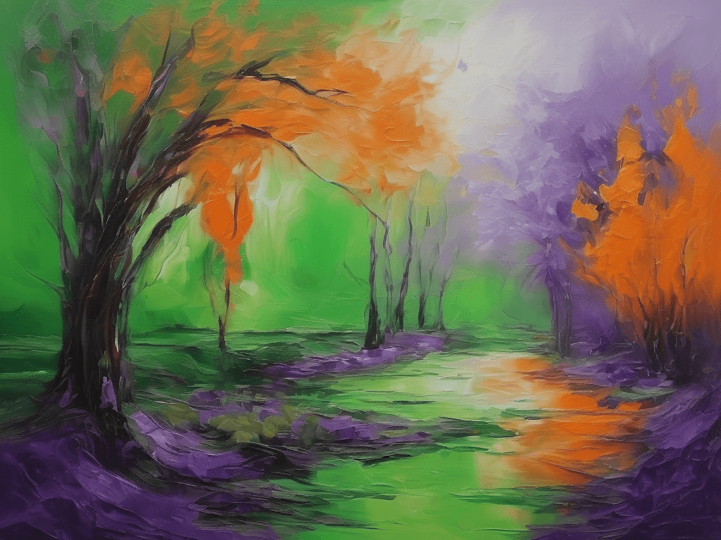
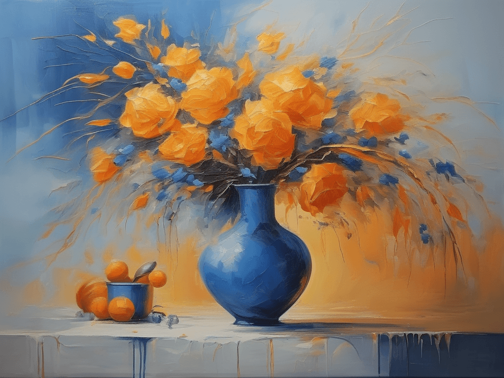
Colors that sit opposite each other on the color wheel, like purple and green or blue and yellow, are known as complementary colors. They produce a vivid contrast and dynamic tension, making them perfect for establishing focal points and infusing drama into your project.
2. Analogous Colors

Colors that are next to each other on the color wheel, like blue and green, are known as analogous colors. They produce a harmonious and aesthetically pleasing effect, making them ideal for establishing a serene and relaxing ambiance in your project.
3. Triadic Colors

Colors that are evenly spaced around the color wheel, forming a triangle—like green, orange, and purple—are known as triadic colors. They produce a harmonious and lively effect, making them excellent for introducing diversity and appeal to your project.
4. Split-Complementary Colors

Split-complementary color schemes involve a base color accompanied by the two colors adjacent to its complement—for example, red paired with yellow-green and blue-green, or blue combined with red-orange and yellow-orange. These schemes offer a contrast akin to complementary colors but with reduced tension and enhanced harmony, rendering them more user-friendly in design.
5. Tetradic [Rectangle] Colors

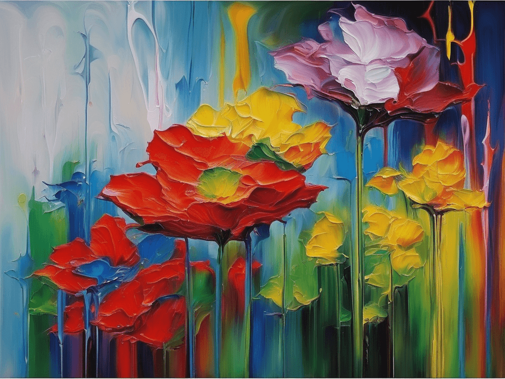
These are colors that consist of two pairs of complementary colors, forming a rectangle on the color wheel, such as red, green, blue, and orange, or purple, yellow, pink, and green. Tetradic colors create a rich and complex effect, making them ideal for creating diversity and depth in your project.
6. Square Colors

These are colors that consist of four colors that are evenly spaced around the color wheel, forming a square, such as red, yellow, blue, and green, or purple, orange, green, and pink. Square colors create a similar effect as tetradic colors, but with more symmetry and balance, making them suitable for creating a harmonious and lively atmosphere in your project.
These are just some of the basic types of color schemes that you can use for your project. You can also experiment with different shades, tints, tones, and saturation levels of the colors to create more variations and nuances.
Color Scheme Generators
If you are feeling overwhelmed by the endless possibilities of the color wheel, or if you are looking for some inspiration and guidance, you can use color palette generators to help you find the best color scheme for your project. Color palette generators are online tools that allow you to create, browse, and customize color palettes based on different criteria, such as:
A. Image

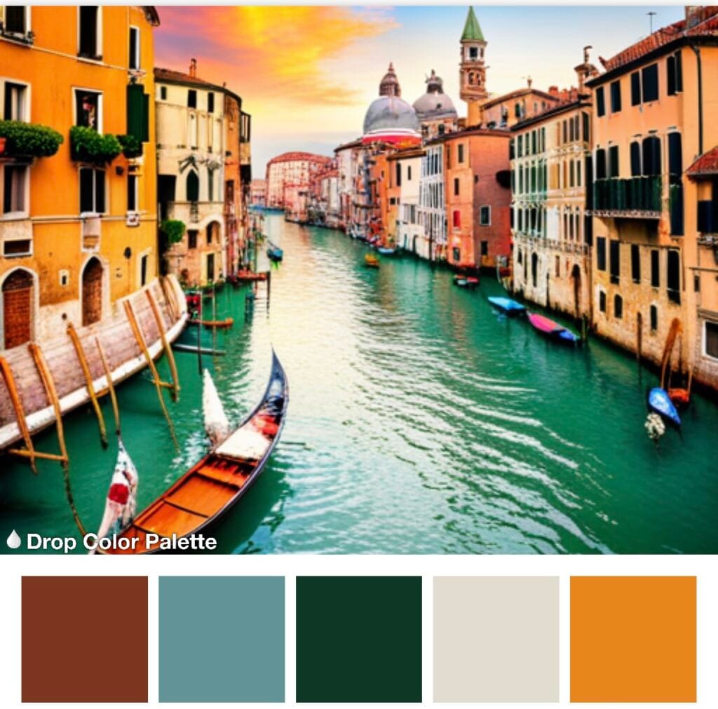
You can upload an image that you like or that matches the theme of your project, and the tool will extract the dominant colors from it and generate a color palette based on them. This is a great way to find colors that work well together and that reflect the mood and style of your project.
B. Keyword
You can enter a keyword that describes the concept or emotion that you want to convey in your project, and the tool will suggest some color palettes that match it. This is a great way to find colors that communicate the right message and that evoke the desired response from your audience.
C. Random
You can generate a random color palette and see if you like it or not. This is a great way to discover new and unexpected color combinations and to challenge yourself to try something different.
Color Scheme Generator Examples
This is a tool that allows you to create color palettes based on the color wheel, image, or keyword. You can also learn more about color theory and how to use colors effectively in your design projects.
This is a tool that allows you to generate and customize random color palettes, or browse through thousands of pre-made palettes created by other users. You can also export and share your palettes with others.
This is a tool that uses artificial intelligence to generate smart and beautiful color palettes based on image, keyword, or website. You can also tweak and refine your palettes with a simple interface.
Examples of Color Schemes in My Work
1. Complementary
2. Analogous

Conclusion
Choosing a color scheme for your next creative project can be fun and easy if you know how to use color theory, the color wheel, and color palette generators. By following these tips and tricks, you can create stunning color schemes that will make your acrylic paintings stand out and impress your audience.
I hope you found this blog post helpful and informative. If you have any questions or feedback, please feel free to leave a comment below. And don’t forget to share your amazing color schemes and projects with me on social media (you can find my socials at the very top of the page). I would love to see what you create! Happy painting!


