Trese Judd Art

Beginner’s Guide: Color Theory in Art

Color Theory in Art: A Beginner's Guide

What Is Color?

an image representing color theory: a colorful abstract painting

Color theory is an incredibly fascinating aspect of art that is often overlooked. In fact, it is a critical element that can make all the difference in the message or story the artist is trying to convey. Color is a key component in mood, contrast, harmony, and emotion, just to name a few. The effective use of color (i.e. color theory) can also boost the overall aesthetic appeal of the artwork and capture the viewer’s attention. In essence, it should be viewed as an intentional choice, rather than random selection.

Artists can utilize color theory to help choose the best colors for their work. They must consider the interactions of colors and the visual impact they will have. Furthermore, they should also be mindful of the potential meaning and symbolism of colors. By understanding the basic principles of color theory, artists can create works that deeply resonate with their audiences while staying true to their artistic vision.

In this blog post, we will dive into the fundamentals of color theory, including what color actually is, how it functions, and how you can incorporate it into your artwork. By the end, you’ll have a solid grasp of color theory and be better equipped to take your art to the next level.

How Does Color Work?

An image of two cars in an urban setting, with neon reds and purples, representing how color works in color theory.

Color is a fascinating and complex aspect of our perception. At its most basic level, color is the way we interpret the light that is reflected or emitted by objects around us. As a matter of fact, light itself is made up of a wide range of electromagnetic waves, spanning different frequencies and wavelengths. However, humans can only see a fraction of these waves, which we call the visible spectrum. This spectrum includes the colors of the rainbow, from vibrant reds to deep violets, and each color corresponds to a unique wavelength of light.

When light interacts with an object, some of it gets absorbed while some of it is reflected. Indeed, it’s this reflected light that we perceive as color. Depending on the wavelength of the reflected light, we see different colors and hues. As an example, if an object absorbs all light except red, we see it as a bright and stunning shade of crimson red. The way we perceive color is complex and multifaceted, and our brains work hard to make sense of the light that surrounds us.

Color Theory Attributes & Categories

Color theory

Color can be described by three attributes: hue, value, and saturation.

Hue: name of the color, such as red, blue, or green. It is determined by the wavelength of the light that is reflected.

Value: the lightness or darkness of the color, from white to black. It is determined by the amount of light that is reflected.

Saturation: the intensity or purity of the color, from dull to bright. It is determined by the amount of gray that is mixed with the color.

It’s important to note, these attributes can be represented by a color wheel. In short, a color wheel is a circular diagram that shows the relationship between colors. 

The color wheel is divided into twelve sections, each containing a primary, secondary, or tertiary color.

Primary Colors are red, yellow, and blue. Basically, they are called primary because they cannot be created by mixing other colors.

Secondary Colors are orange, green, and violet. In sum, they are created by mixing two primary colors.

Tertiary Colors are red-orange, yellow-orange, yellow-green, blue-green, blue-violet, and red-violet. In sum, they are created by mixing a primary and a secondary color.

Moreover, the color wheel can help us understand how colors interact and complement each other. To learn more, visit my blog post on the color wheel.

How To Use Color Theory in Art

an image of paint brushes laying on a white surface with paint in various vibrant colors on them and the surface. Representing how to use color theory in art.

While There Are Many Ways to Use Color in Art, Here Are A Few of the Most Common:

1. To Create Contrast: Contrast is the difference between two or more colors that makes them stand out from each other. Contrast can be used to create focal points, emphasize shapes, or add drama to a composition. For example, using complementary colors (colors that are opposite on the color wheel) can create a strong contrast. 

2. To Create Harmony: Harmony is the balance and unity between two or more colors that makes them pleasing to the eye. Harmony can be used to create a sense of calmness, order, or coherence in a composition. For example, using analogous colors (colors that are adjacent on the color wheel) can create a harmonious effect.

3. To Create Mood: Mood is the feeling or emotion that a color evokes in the viewer. Mood can certainly be used to convey a message, express an idea, or set a tone for a composition. For example, using warm colors (colors that contain red or yellow) can create a mood of excitement, energy, or passion; while using cool colors (colors that contain blue or green) can create a mood of calmness, relaxation, or sadness.

A Few Other Ways To Consider

4. Attract Attention: One way an artist can use color is to attract attention to a specific area or element within the artwork. Bright, bold colors can stand out and grab the viewer’s eye, thus bringing focus to a particular subject or message the artist wants to convey. For example, a bright red color might be used to draw attention to a pair of lips in a portrait.

5. Influence Emotions: Color has a powerful influence on emotion, and artists can use this to their advantage. For example, cool colors such as blue and green can create a calming, peaceful atmosphere, while warmer colors such as red and yellow can create feelings of excitement and energy. An artist may choose to use certain colors to enhance the emotional impact of their work, such as using depressing greys and blues to evoke sadness or stagnant greens and browns for melancholy nature scenes.

6. Convey Messages: Color can be used as a symbol to convey messages or ideas to the viewer. For example, a painting with predominantly green hues may represent growth or nature, while red might suggest passion or danger. Similarly, a pop artist may use bright, vibrant colors to represent consumerism or popular culture. An artist can carefully select colors to create a specific theme or message for their artwork. As a result, the viewer can decode and interpret the symbolism based on their personal experiences and cultural contexts.

Conclusion

acrylic artistry
Image Source: Van3ssa_ via Pixabay

In conclusion, when it comes to the world of art, one of the most interesting and captivating topics that you can explore is color theory. As an artist, color theory can play an essential role in your creative process. Thus allowing you to improve your skills and take your art to the next level. By taking the time to understand the principles of color theory, you can learn how to use color as a tool. Specifically, a tool one can use to create more dynamic and expressive artworks that truly speak to your audience. From understanding the basic components of color to exploring the psychology of different hues and shades, there is so much to discover and explore in this fascinating world. So, if you’re looking to expand your artistic horizons and take your artistic journey to new heights, you’re in the right place.

Continue Learning Color Theory

Explore Other Topics

25 Popular Art Styles

In my first blog post, I have compiled a list of 25 popular art styles that every art enthusiast should be familiar with! Through the list, I aim to provide insights into each style – their unique characteristics, as well as a lot of similarities.
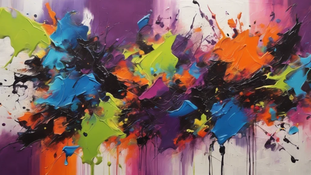
Read More »
acrylic painting techniques displayed in a gorgeous, blue and green, nature-inspired work of art

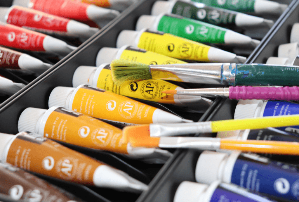
Acrylic Painting Techniques

Acrylic painting is a popular medium among artists due to its versatility and vibrant colors. With the right techniques, acrylic paint can be used to create a wide range of effects, from smooth and blended to textured and layered.

Read More »
Picture of Trese Judd

Trese Judd

Embark on a journey of inspiration with Trese Judd, a visionary artist who has 4+ decades of experience painting. Her enlightening series of blog posts will take you on a breathtaking ride through her expertise and artistic prowess. Each post has been skillfully crafted by the artist herself, allowing you to delve deeper into her life and work, and connect with her on a personal level. To learn more about Trese, click on her photo above.

Leave a Reply

Your email address will not be published. Required fields are marked *